
AI-powered delivery date estimates to boost conversion
Give shoppers peace of mind and protect and grow your bottom line
Personalized tracking experiences to build brand loyalty
Returns and exchanges management to mitigate fraud and reward best customers
Proactive communication to drive customer lifetime value
Delivery claim management to tackle fraud and build trust
The Best Product Detail Page Tips for Converting Visitors
%20(27).webp)
Buying decisions predominantly happen on product pages. That’s why it is to your company’s advantage to invest in creating product description pages that convert. Fortunately, there are a number of best practices you can implement that will increase your odds of converting visitors. For example, do your product detail pages contain clear, high-resolution product photos in multiple sizes or colors? Do they make store policy information as clear as possible? Do they use an estimated delivery date solution to give customers the confidence to make the purchase?
These and other product detail page recommendations can help increase your store’s performance—but first, let’s start with some basics.
What is a product detail page?
Simply put, a product detail page (PDP) is a customer-facing page on your website that provides information on a specific product. Ideally, your PDPs should answer any question your customers may have about a product, as well as encourage them to either purchase the product or engage further with your brand.
As an example, take a look at the following page from Tumi, highlighting its Short Trip Expandable 4 Wheeled Packing Case:

On the page, you can see:
- Multiple product photos, including the ability to zoom in on each picture
- The price of the item
- Payment options that are available
- The stock status of the item (in this case, “Out of Stock”)
- An expandable “About this Item” section, which includes the item’s code and product description, as well as links to Tumi’s product warranty and return policy pages
- An expandable “Features and Specifications” section with the item’s dimensions, measurements, capacity, materials, and internal and external features
- An expandable “May We Help?” section with phone and email options for contacting customer support
- A “Ratings & Reviews” section
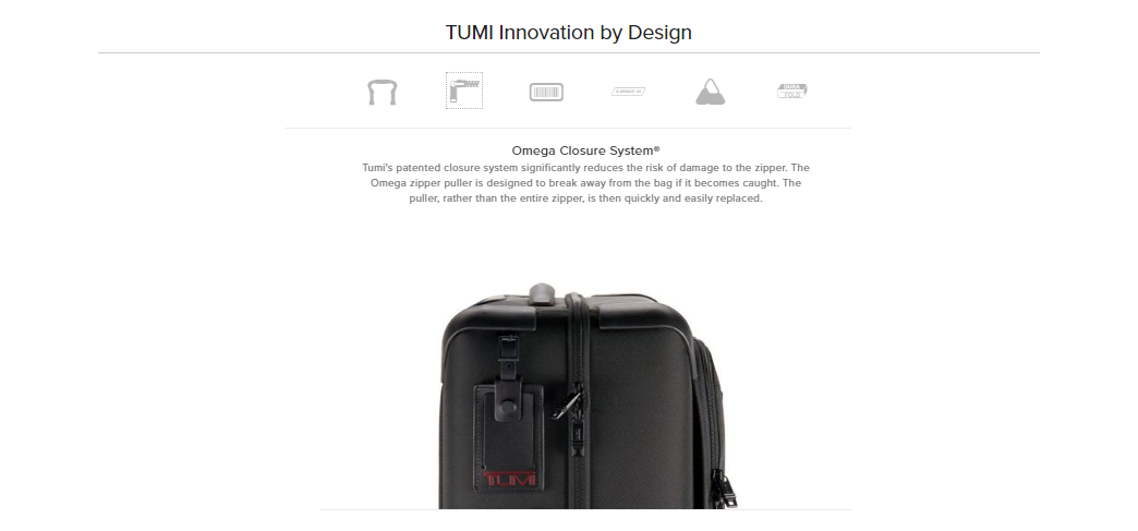
- A breakdown of Tumi-specific features:

What makes a good product detail page?
Good PDPs don’t happen by accident. Product detail pages may seem straightforward, but as retailers continue to innovate in this space, there are a number of best practices you’ll want to consider that can transform your product description pages from simple brochureware into compelling collateral that convert visitors on your behalf.
Your product description page copy
Great PDP copy isn’t just descriptive. Every element—from the product’s title through to the product description and checkout button text—should be written to connect specifically with your business’s target buyers.
One way to tell whether or not you’re using language that will resonate with your customers is to monitor your product reviews and other sources of feedback. If you see recurring themes in their language, test incorporating it into your product copy to make your PDPs feel more authentic and engaging.
A polished presentation
First impressions matter. Your PDP communicates the quality of your products both directly and indirectly. To create the best product page design, make sure you include:
- Clear, high-resolution product photos
- Error free product copy
- The consistent use of brand colors, imagery styles, and typography
- Appropriate prioritization and sequencing of product details
- Page layouts that balance imagery, text, and white space to move visitors toward the checkout button
Detailed information
Add substance to the style of your product description pages by incorporating as many of the following details as possible:
- Accurate size charts
- Product pictures for each size or color variant you sell
- Product pictures from a variety of angles (360-degree animations and video can be useful here as well) and with contextual clues where possible especially to demonstrate size
- The ability to zoom into individual images
For other ideas on the types of detailed information you might include on your product pages, look to your return reasons data. If you’re using an online returns portal like Narvar, you should have visibility into the reasons customers are making returns (this information isn’t easily accessible or aggregated when returns are processed manually). This data will show you where you may need to provide better details, stronger images, or other additional information to avoid misunderstandings and prevent returns.
Social proof
Your customers can be your products’ best advocates. Where possible, introduce their feedback, reviews, and user-generated content into your PDPs to encourage others to purchase.
Take a look at this DSW product page, as an example. The page’s color and size selection section features three places where customer fit reviews have been incorporated into the PDP.

In addition, DSW displays “Style Inspiration” in the form of product pictures from real users, curated via social media.

A sense of urgency
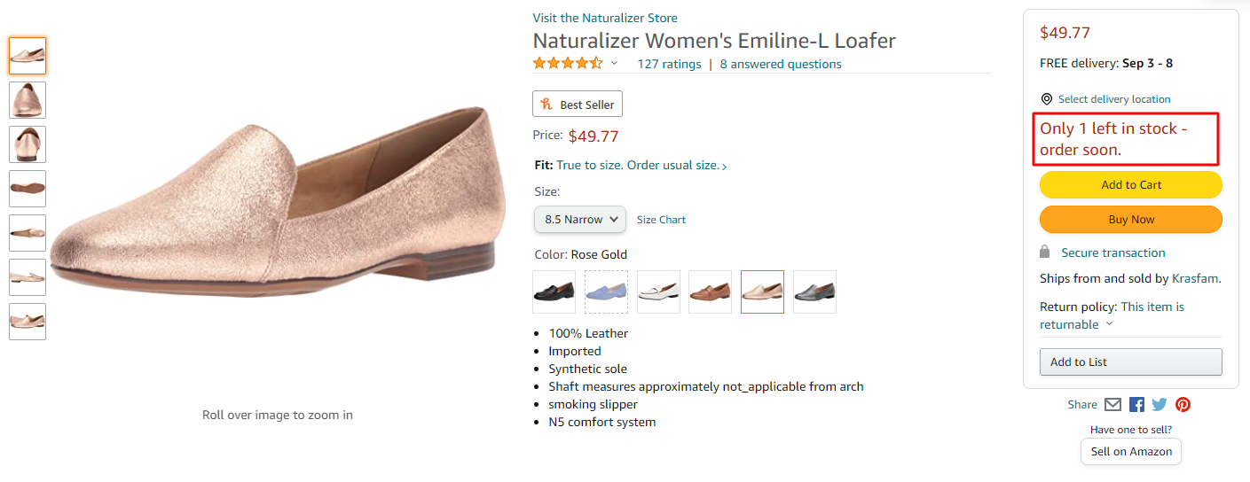
Retailers have a number of options for introducing urgency to their PDPs, such as low-stock alerts, purchase timers, and notifications regarding the number of other users viewing an item at a given time.
Here, Amazon introduces urgency with a low-stock alert for a Naturalizer loafer:

The key with urgency, however, is to not overdo it. Deploying too many of these options at once—or worse, lying about the real degree of urgency—risks leaving visitors feeling manipulated and mistrustful of your brand.
Post-purchase expectations
Finally, another key element of a good product detail page is setting proper expectations for the post-purchase experience. Use your product page text to communicate expected fulfillment and delivery timelines, as well as to provide visibility into your return policy.
According to Narvar’s recent Returns Policy Benchmark Report, 51% of retailers provide information about their returns policy on their PDPs.
How do I create a product detail page?
Don’t think of building product detail pages as something you’ll do once. There’s no “set it and forget it” when it comes to creating product pages that convert.
Start by assessing your existing product pages against the criteria described above. If you’re missing any of these elements, try to identify those that you can integrate most easily into your PDPs and begin updating your pages there.
If you don’t already have a retail heat-mapping tool installed or an A/B testing plan in place, now is the time to add them. As you begin making changes to your PDPs, it’s important to determine—as scientifically as possible—whether your adjustments are having the desired effect (or whether they’re setting your performance back).
Ultimately, making ongoing, iterative changes to your PDPs to bring them in line with modern best practices is the best way to ensure your product pages are supporting your conversion goals to the greatest degree possible.
If you found this article helpful, you may also like our blog, “The Unsexy Reality of How to Prevent Returns.”
Get more insights from the experts
GET STARTED
Power every moment after the buy
Build trust. Protect margins. Drive growth — “Beyond Buy.”


