
AI-powered delivery date estimates to boost conversion
Give shoppers peace of mind and protect and grow your bottom line
Personalized tracking experiences to build brand loyalty
Returns and exchanges management to mitigate fraud and reward best customers
Proactive communication to drive customer lifetime value
Delivery claim management to tackle fraud and build trust
Door to Door in the Digital Age: Designing Push Communications

Remember the days when door-to-door salesmen reigned? Maybe your grandmother has a set of Encyclopedia Britannica, or maybe your parents have a set of classic Tupperware or Cutco knives. Successful salesmen were expert communicators, knowing their audience, their messaging, and their channel down to a “t.” Door-to-door communication isn’t limited to sales, either. Today, door-to-door canvassing is still a powerful mode of political outreach, mobilizing voters more effectively than phone, email, or mass-media communication.Door-to-door communication is “push communication” at its purest—the insertion of information into a user’s personal space. This information could be welcome or unwelcome: the local fire department with a safety bulletin versus an annoying neighbor at your door asking you to “keep it down.” While door-to-door communication is becoming less prevalent today due to increasingly closed-off lives and more urbanized living, technology has opened up a new avenue of push communication: our digital spaces.
Just as door-to-door communications have been a powerful tool in the physical world, push notifications are becoming equally critical in the digital world.
Digital Spaces
We carry our digital spaces with us and receive a constant stream of push communication. Next time you’re in a crowded room, take a moment to listen for the buzzes and “dings” that represent the avalanche of information pouring into users’ lives. Of course, every user has limited energy and attention to process all this information. If they find the notifications from your app or company intrusive or unhelpful, they’ll shut it off, causing you to miss opportunities and lose relevancy.This is where design strategy comes in. Just as door-to-door communications have been a powerful tool for selling products, building communities, or delivering critical information in the physical world, push notifications are becoming equally critical for the same reasons in the digital world. Disciplined design helps us navigate the many different considerations—content, context, medium, volume—creating digital push communications that don’t cause the user to close the door on you. [caption id="attachment_1404" align="aligncenter" width="657"]
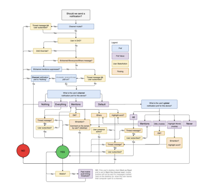
This complex map of Slack’s push behavior reveals the intricacies of careful push design.[/caption]
Status Saturation
Let’s take a hypothetical look at two different apps: a social media app sharing photos and status updates, and an advanced smart-home app monitoring environmental, remote entry, and security systems. You can probably imagine many situations where the smart-home app’s notifications would be far more important than any social media buzz. After all, why should a photo tag, a game invite, or a poke compete with a home intrusion or a power outage?A deeper dive reveals more complexities, however. What if the user is a blogger whose social media presence is mission critical to his income? What if she’s a teen who only cares about unlocking the door after school?Even within the smart-home app itself, different users will have critically different needs. A mother of three probably wants to see entry notifications for her kids, while a house of young professionals would hide that information out of respect for each others’ privacy. Two working parents want to be sure the baby’s nursery in a sunny corner stays at a comfortable temperature during the day, while the 3D animator rendering her latest scene already knows her workstation will bake the unoccupied studio as she catches some much-needed sleep.Each of these users has different and often contradictory notification needs, and pushing the wrong notifications could break their entire user experience: violating the privacy of respectful roommates or waking a sleep-deprived artist. At minimum, a designer faced with these challenges must give users the power to control their own notifications. A savvy designer can go further. Empowered with data, they can predict and automatically adapt to each user’s needs.
Priorities and Processes
One of our primary objectives at Narvar is keeping the customer informed about where their packages are, no matter which of our 400+ retailers they originated from and where they live. That’s easier said than done. Along a package’s journey, our system currently identifies 35 unique states, each useful in their own way to someone, but not everyone.
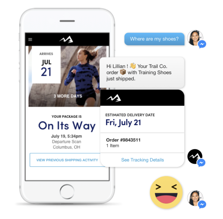
Combining our priorities with our understanding of medium, we can map messages to the channels best suited for their consumption to create an uninterrupted brand experience.
Our first step is to prioritize our messages, but just as we can’t simply target one kind of user, we can’t prioritize into just one list. We ask ourselves many questions, for example: Which messages are critical to the package’s safe and timely delivery? Which messages resulted in the most engagement in urban areas? Which messages perform best in reducing support contacts and returns? Evaluating each message’s priority across many dimensions allows us to intelligently react to each user’s needs and appetite as we discover more about them.The next step is to find the right fit between the message and its medium. Between email, SMS, Facebook, Instagram, WhatsApp, and so on, there’s no shortage of channels to reach users. Each channel has its own unique attributes and strengths. Before sending a message to any channel, we consider many factors. Is the message public or private: did the customer buy the hottest new toy, or a personal item? Is the message time-sensitive: is it the final delivery attempt, or was the package just delayed by a storm? Is the message actionable: do they need to correct their address, or did the package just leave the warehouse?Combining our priorities with our understanding of medium, we can map messages to the channels best suited for their consumption to create an uninterrupted brand experience. What’s left is to identify the customer’s needs and appetite for information. At Narvar, we use a broad base of data to adjust our customer messaging, including geographic location, demographic group, product information, and even time of day. We can consider the customer’s past purchase history with each retailer separately, or their past engagement with our messages. Customers manually setting preferences and linking external channels will prompt us to re-prioritize and adjust our messaging to fit.
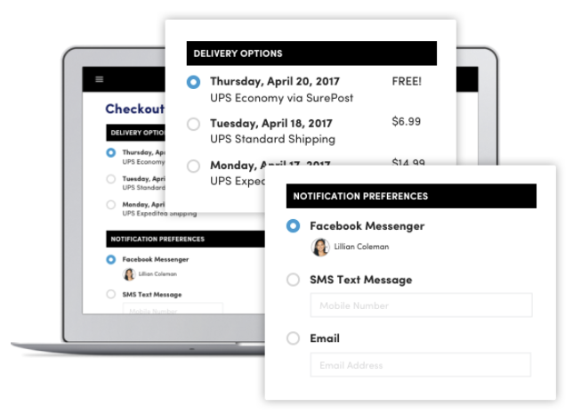
In the real world, this understanding helps our retailers achieve measurable business goals, like reducing returns and replacements. A real-time delivery update via SMS to an urban customer can mean the difference between a successful delivery and a stolen package. On the other hand, a more passive “delivered” email to suburban customers frees up mental bandwidth for proactive customer service, setting expectations and preventing frustration.
Designers must strike a delicate balance between information and intrusion in order to maintain a proper and consistent brand experience.
Evolving Multichannel Design
Sometimes, messaging design strategy is obvious—an address correction notification is undoubtedly a message of the highest priority, deserving of a multi-channel push. Other times, there are hidden complexities multiplied by customers' diverse needs and the constantly changing digital environment we live in today. Creating strong guidelines for these decisions helps ensure consistency in experience design and reduces development time.In 1970, the New York City Transit Authority established a breakthrough guideline on graphic identity and real-world user experience design. Exacting and thorough, it created reassuringly consistent signs and stations, transforming a chaotic and perplexing subway system into something navigable by locals and tourists alike. Fast forwarding to the 2010s, Apple and Google have created guidelines for their iOS and Android systems, each defining a set of graphic and animation rules that both clearly differentiate the systems from each other yet stay out of the user's way. As their hardware and software becomes ubiquitous, Apple and Google must keep their presence consistent throughout the incredible share of user attention they command, and also anticipate the future use cases users and developers in their ecosystems will invent.The next evolution of the design guideline must address push communications. As users and customers become accustomed to push messaging in their lives, designers must strike a delicate balance between information and intrusion in order to maintain a proper and consistent brand experience. At Narvar, we're building that guideline to help our team to not only navigate the complex activities of shipping and fulfillment, but to continually use personalization and data to simplify the lives of consumers.
